Choosing fine art prints for a modern interior is rarely a matter of just finding a “beautiful picture.” In contemporary spaces—where clarity, restraint, and architectural balance are paramount—art is not an afterthought. It is a structural element. The right artwork shapes the rhythm of a room, commands attention without shouting, and creates a lasting focal point that feels deeply deliberate.
Whether you are a collector, an interior designer, or refining your own home, this guide will help you move from simply filling a blank wall to intentionally curating your environment. Here are the core principles of scale, tonal balance, and placement to guide your decision.
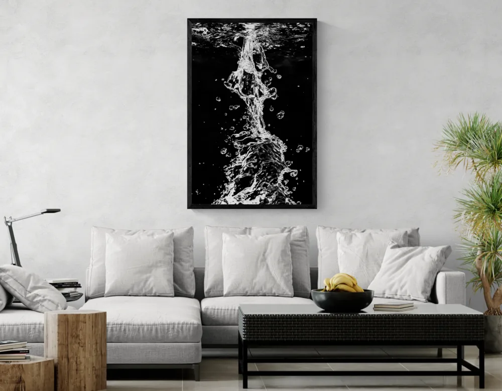
1. The Architecture of Scale: Commanding the Space
The single most common mistake in modern interior styling is underestimating scale. A minimalist room does not mean the art should be small; in fact, minimal architecture demands pieces with enough visual weight to hold the space confidently.
The Power of the “Single Statement”: In modern interiors, one large-format piece (e.g., 100×150 cm) is almost always more powerful than a gallery wall of smaller frames. A large print simplifies the visual field, creating a sense of calm and luxury.
The 2/3 Proportion Rule: When placing art above a sofa, bed, or sideboard, the artwork should span roughly 2/3 to 3/4 of the furniture’s width. This anchors the piece to the furniture below it, creating a cohesive architectural block.
The Gallery Height Standard: Hang your piece so its vertical center rests exactly at human eye level—typically 145 to 150 cm (57–60 inches) from the floor. This connects the artwork directly to the viewer, rather than floating it too close to the ceiling.
2. Tonal Gravity: Black & White vs. Color
Modern spaces rely heavily on texture, light, and natural materials like wood, stone, and concrete. Your choice of print must converse with these elements.
Black and White (The Structural Choice): B&W fine art photography is the ultimate tool for modernism. Stripped of color, an image becomes pure geometry, light, and texture. It integrates seamlessly into any space, acting as an anchor that never clashes with changing interior trends.
Color as Atmosphere: If you choose color, it must be intentional. A fine art print should not be chosen merely to “match the decor.” Instead, look for a shared tonal temperature. A moody, cool-toned landscape can deepen a room with rich woods, while a warm abstract can soften a stark, concrete-heavy space.
3. Subject Matter: Matching Art to the Room’s Vibe
The subject of the work dictates the psychological temperature of the room:
Nature & Landscapes: Bring breath, openness, and an organic rhythm into highly structured urban apartments.
Architecture & Urban: Reinforce structure and precision. Ideal for home offices or brutalist spaces.
Abstracts: Introduce movement and a modern edge. Perfect for stark, minimalist rooms.
Figurative & Nude: Add an intimate, quiet human presence, best suited for private spaces like bedrooms.
4. Framing and Presence
A frame should act as a quiet bridge between the art and the architecture. In modern spaces, opt for slim, minimalist profiles (like thin aluminum shadow boxes or narrow oak) rather than heavy, ornate borders. Additionally, ensure your art is printed on high-quality, glare-reducing fine art paper. A premium finish absorbs ambient light gracefully, allowing you to see the deepest blacks and subtle tonal transitions without distracting reflections.
Explore our archival printing process and materials here.
Curator’s Red Flags: 3 Mistakes to Avoid
The “Postage Stamp” Effect: Placing a small 40×50 cm print in the dead center of a massive, empty wall. If the wall is grand, the art must match its ambition.
Hanging Too High: Art should connect with the furniture and the people in the room. If you have to tilt your head up to see it, it is too high.
Ignoring the Light Source: Never place a print where harsh, direct sunlight hits it constantly, and ensure your evening spotlighting illuminates the canvas evenly.
Quick Reference (FAQ)
How large should art be over a standard sofa?
For a typical 220cm (86″) sofa, aim for a print or diptych that is roughly 140–160cm wide.
Does a modern room require modern art?
Not necessarily. The contrast of a classic subject (like a timeless B&W landscape) presented in a sleek, contemporary frame often creates the most striking dynamic in an ultra-modern room.
How do I choose between one large print and a set?
Choose one large print for maximum impact and visual calm. Choose a set (like a diptych or triptych) if your wall is exceptionally wide and you want to introduce a sense of rhythm and sequence.
Explore the Collections
To explore artworks through a specific visual lens, begin here:
Large Wall Art for Modern Interiors — Statement pieces crafted to anchor expansive walls.
Black and White Wall Art — Timeless compositions focused on light, shadow, and geometry.
Limited Edition Nude Fine Art Prints — Subtle, emotional depth for private spaces.
Dive deeper into specific moods: Nature • Architecture & Urban • Abstract • Figurative